Central Park Collage
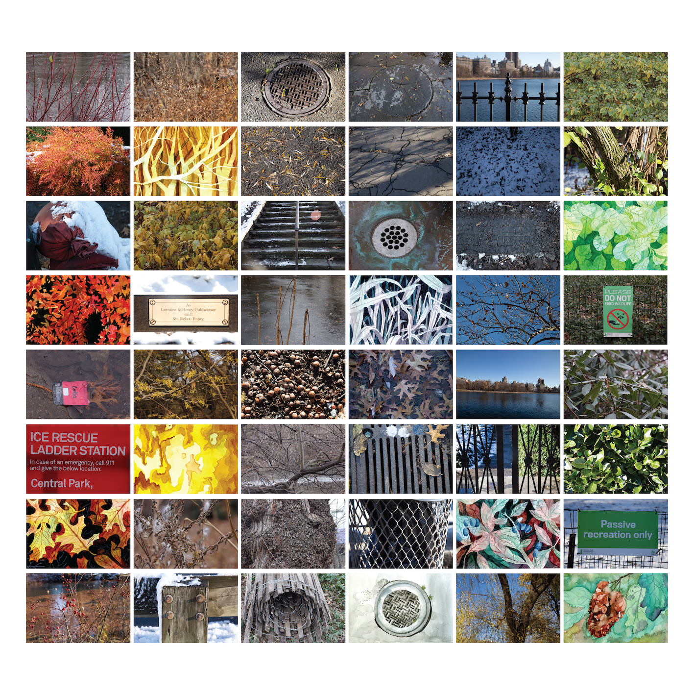
Project Brief
This project was the final project for my 'Drawing and Imaging' class. We had to create a cite-specific collage of a specific theme, combining tactile and digital elements. It was a 3-week project, including project conception, initial proposal, two review stages and a final critique.
Design Process
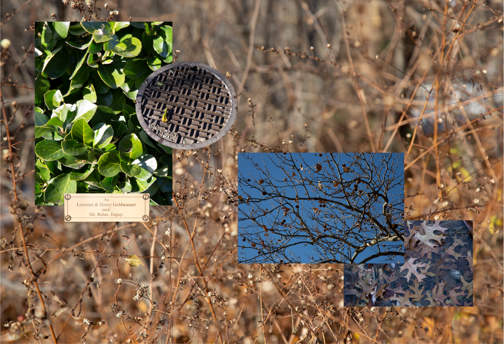
'In New York, we are surrounded by buildings, pollution, people and constructions. Amongst this construction, finding a natural spot seems like a breath of fresh air. However, these spots, like parks and gardens, have also been constructed.' My project focussed on Central Park: a seemingly untainted natural space that's a product of intense construction and gentrification.
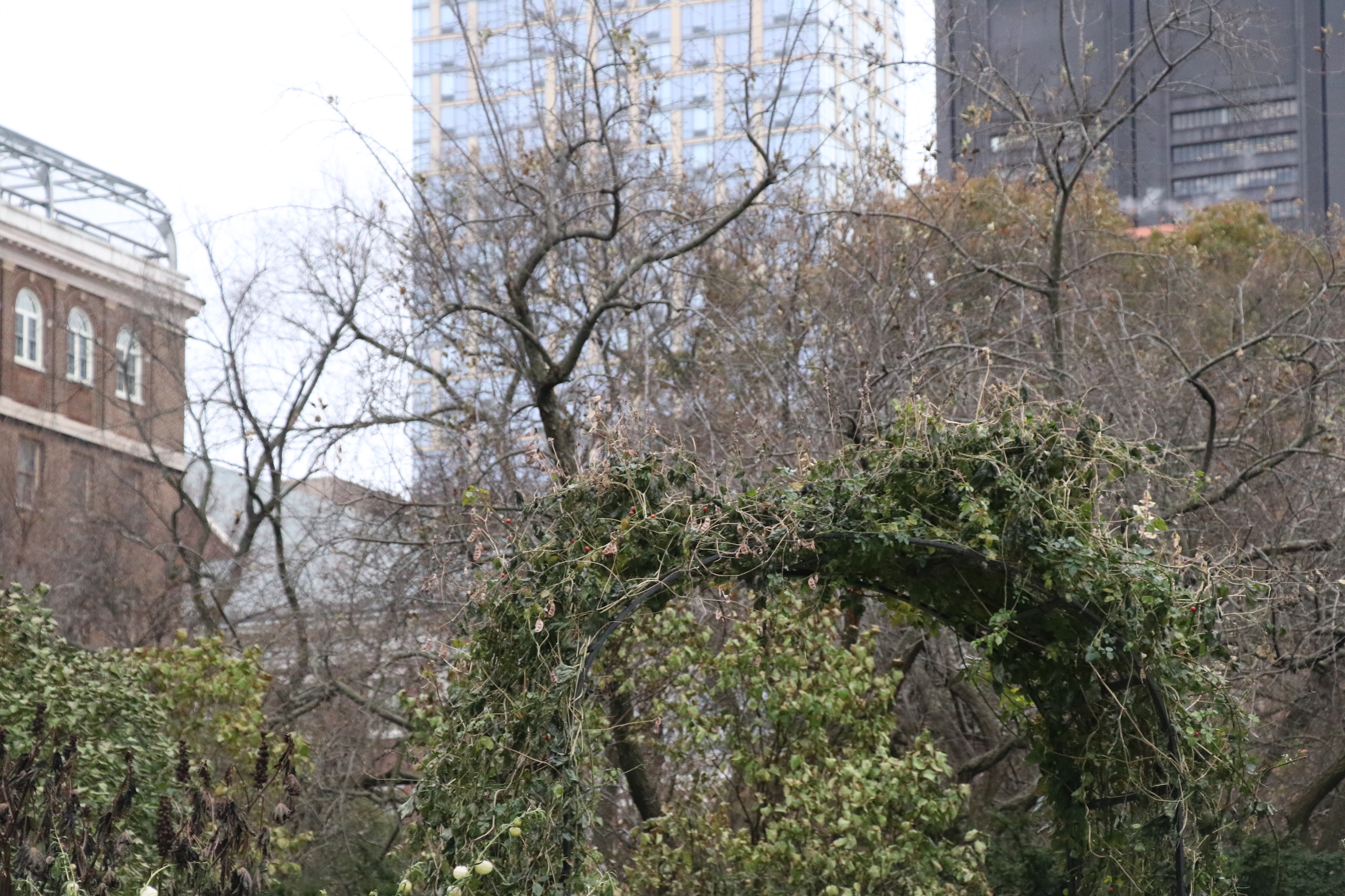
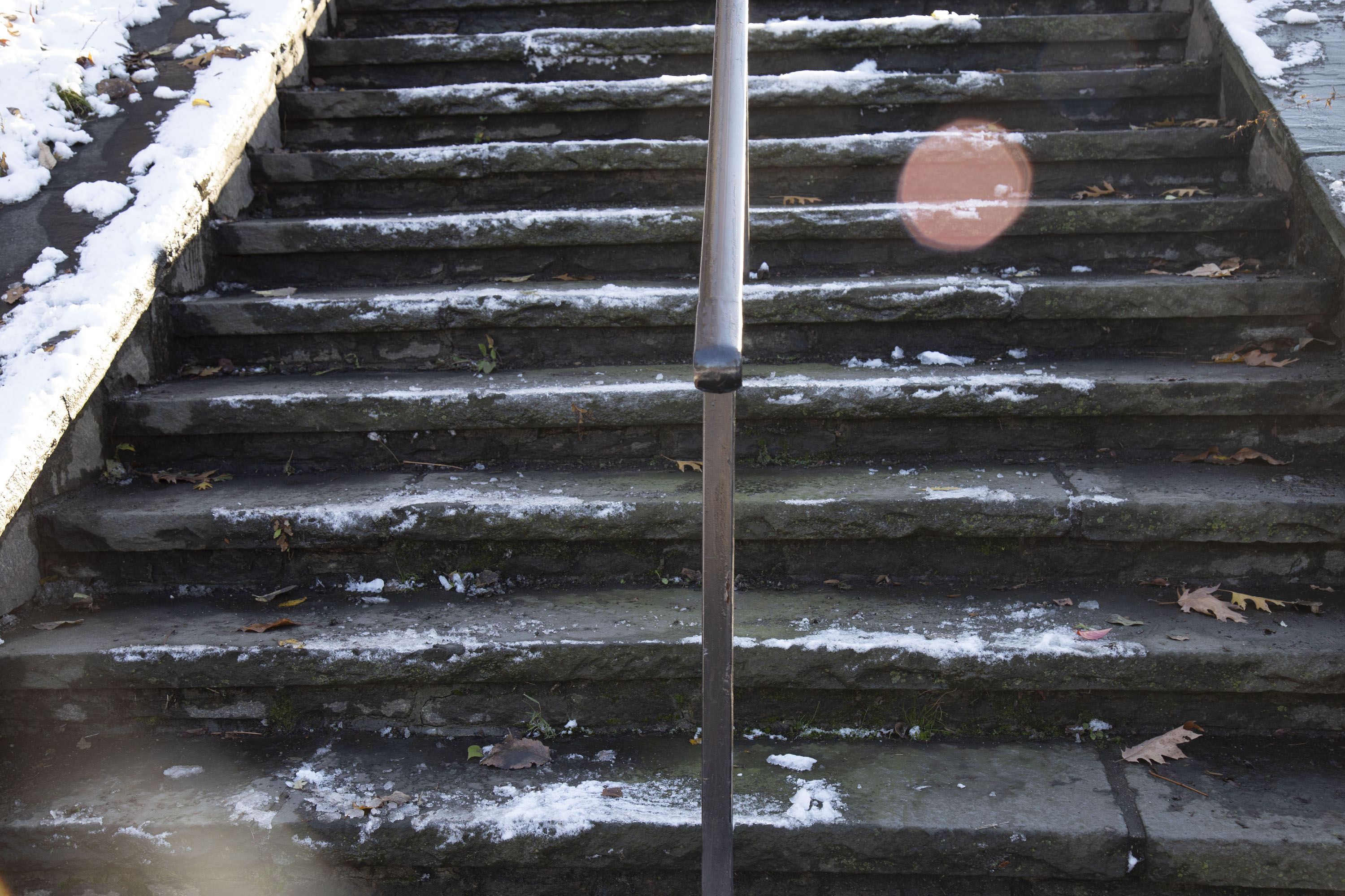
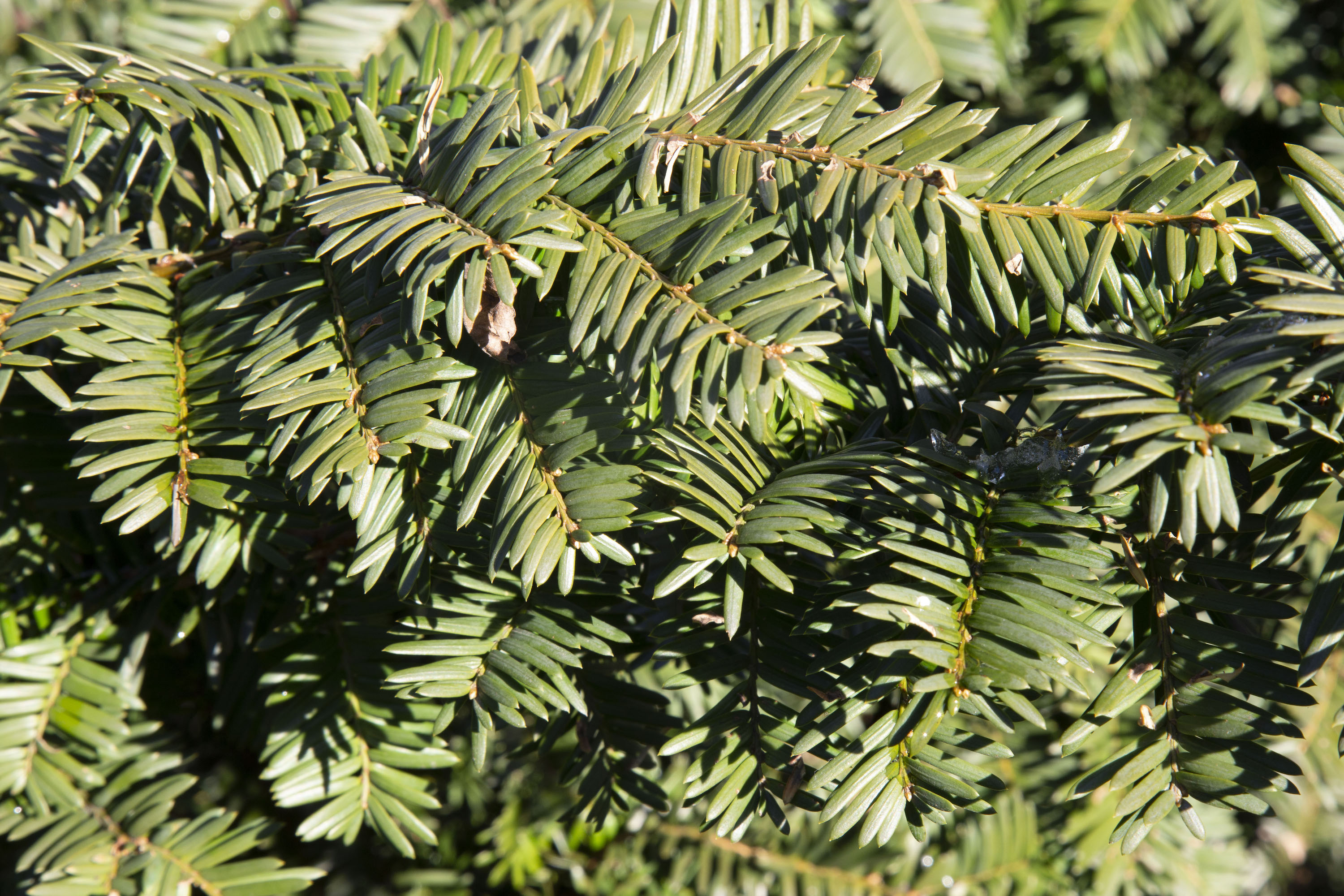
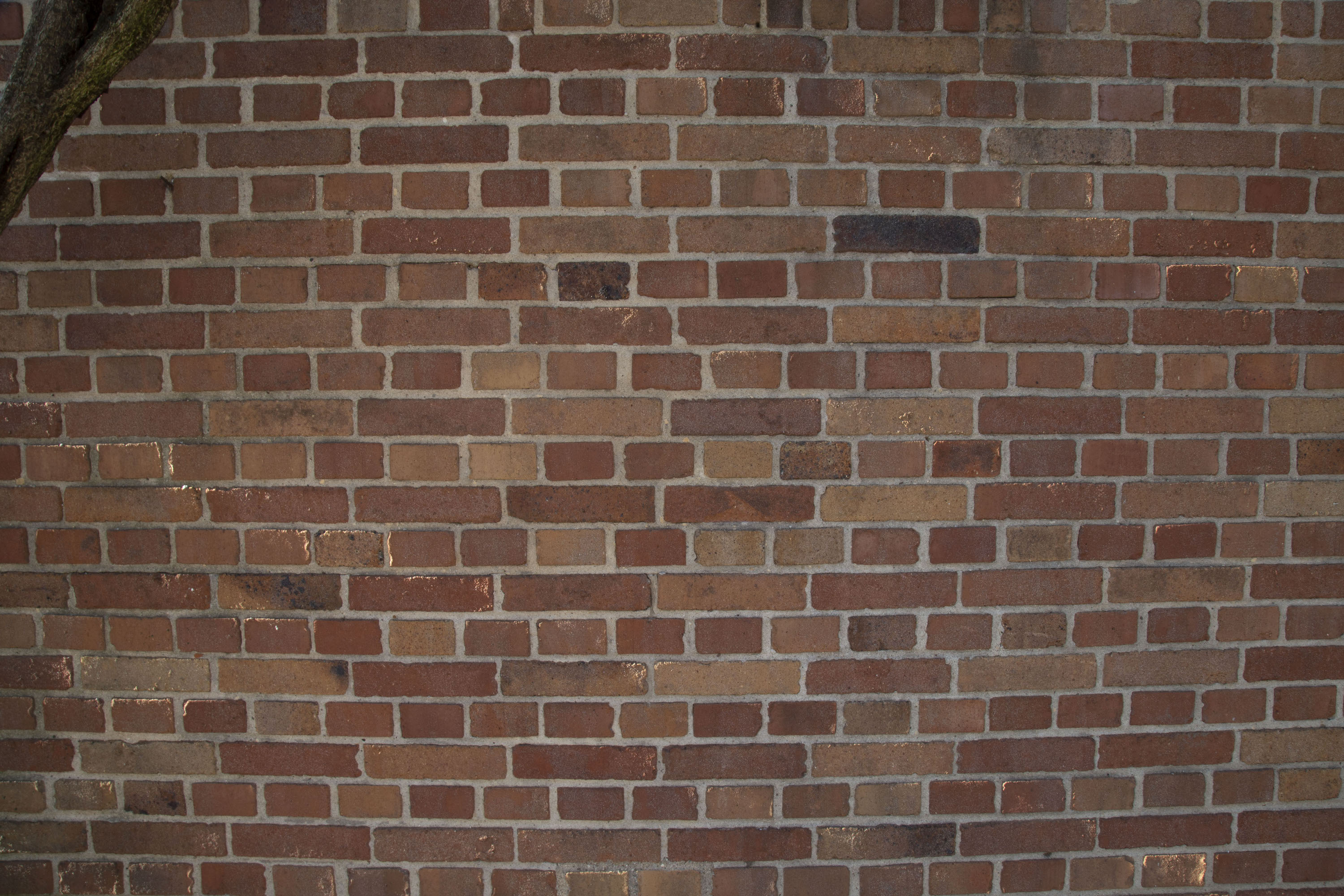
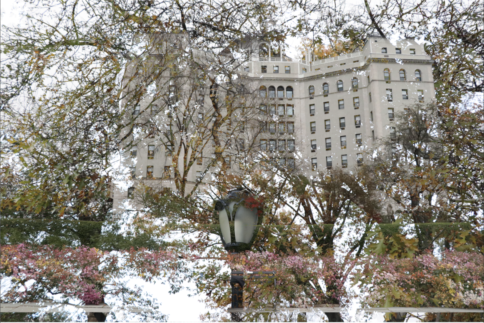
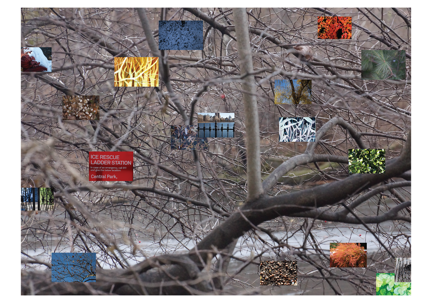
This project ended very differently from what I had initially envisioned. Initially, I photographed the lesser travelled North Central Park, focussing on capturing artifice amongst the greenery. I also tried photoshopping parts of the park together.
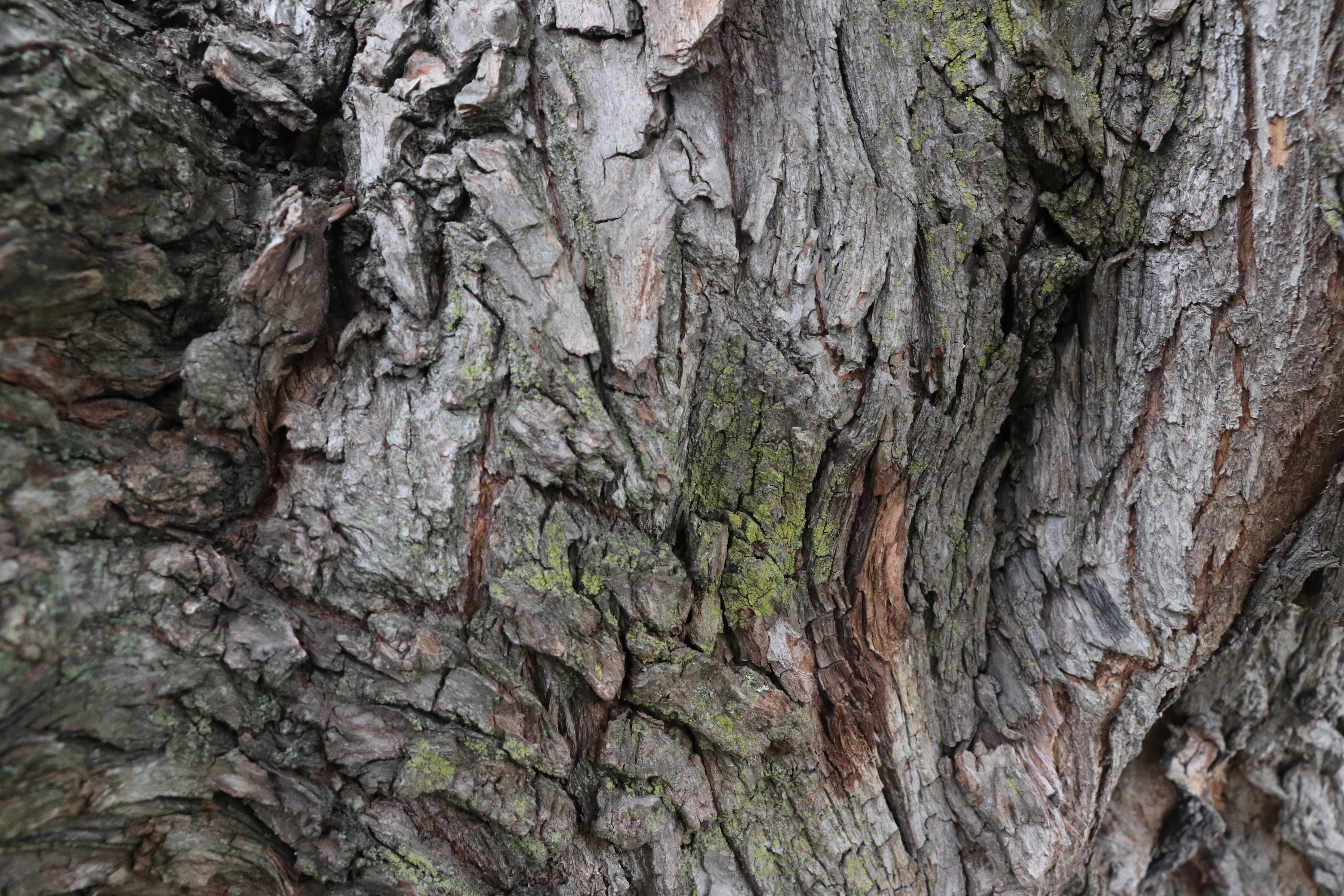
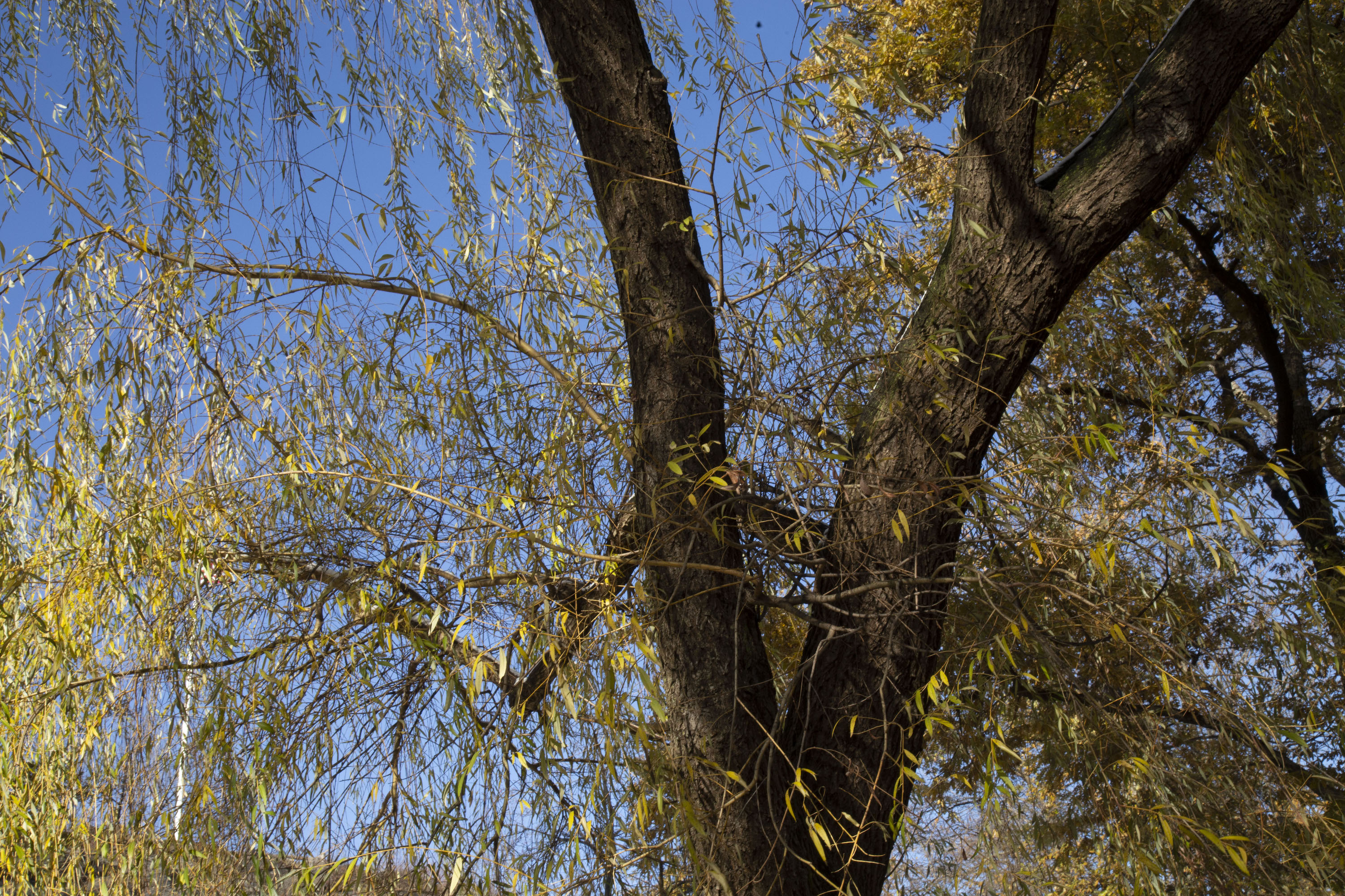
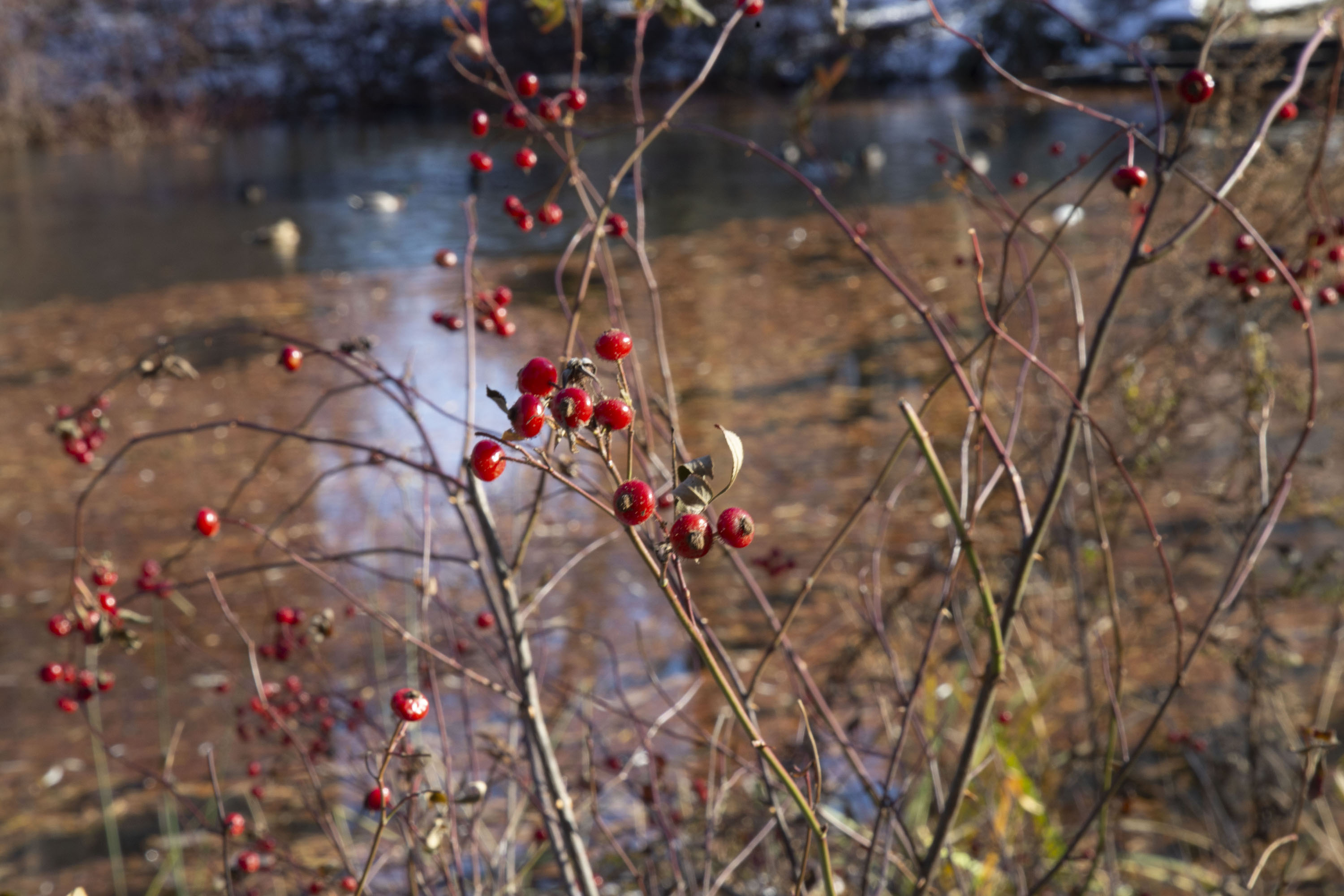
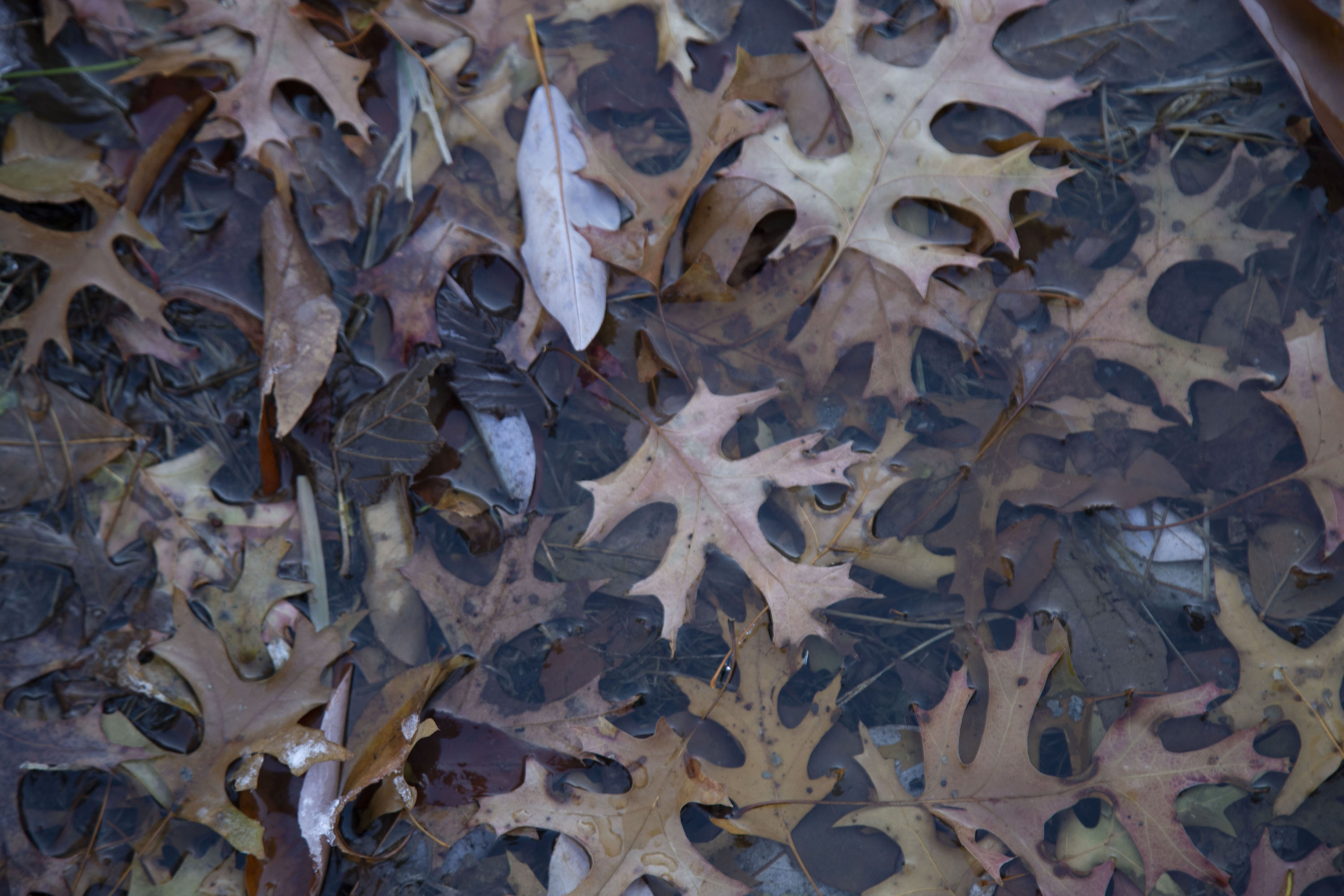
I planned to combine photographs and painting, creating a texture with plastic and metal scraps.
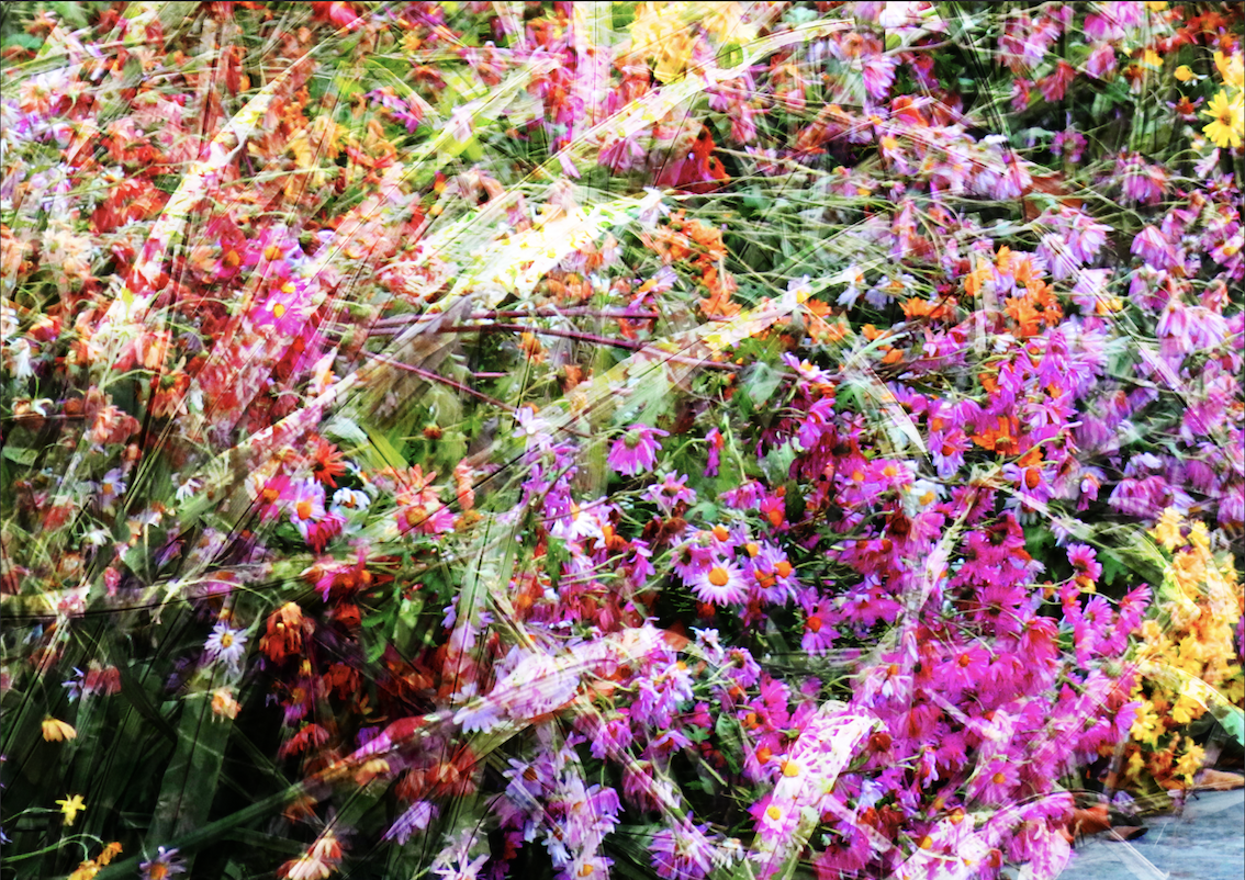
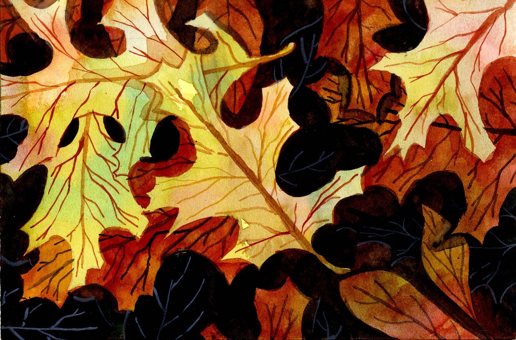
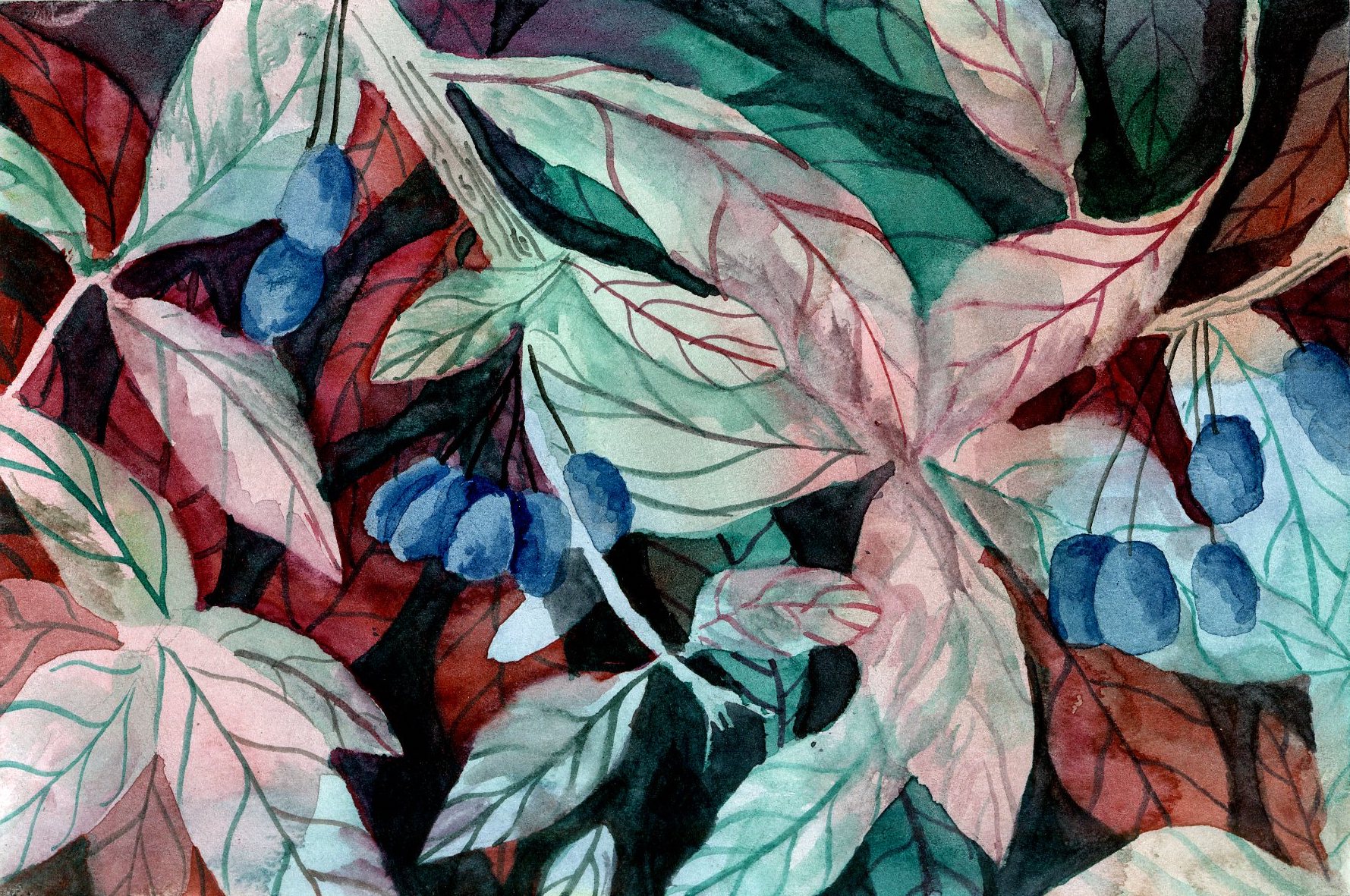
After this first try, I realised I was most interested in close-ups of textures. The tight frame on a bunch of leaves divorced the subject from it's setting. By taking close shots of natural and man-made elements, I could guide what the user would see. My collage is in a grid; at first glance, it is filled with greenery, a closer look reveals posters, garbage, benches and barriers.
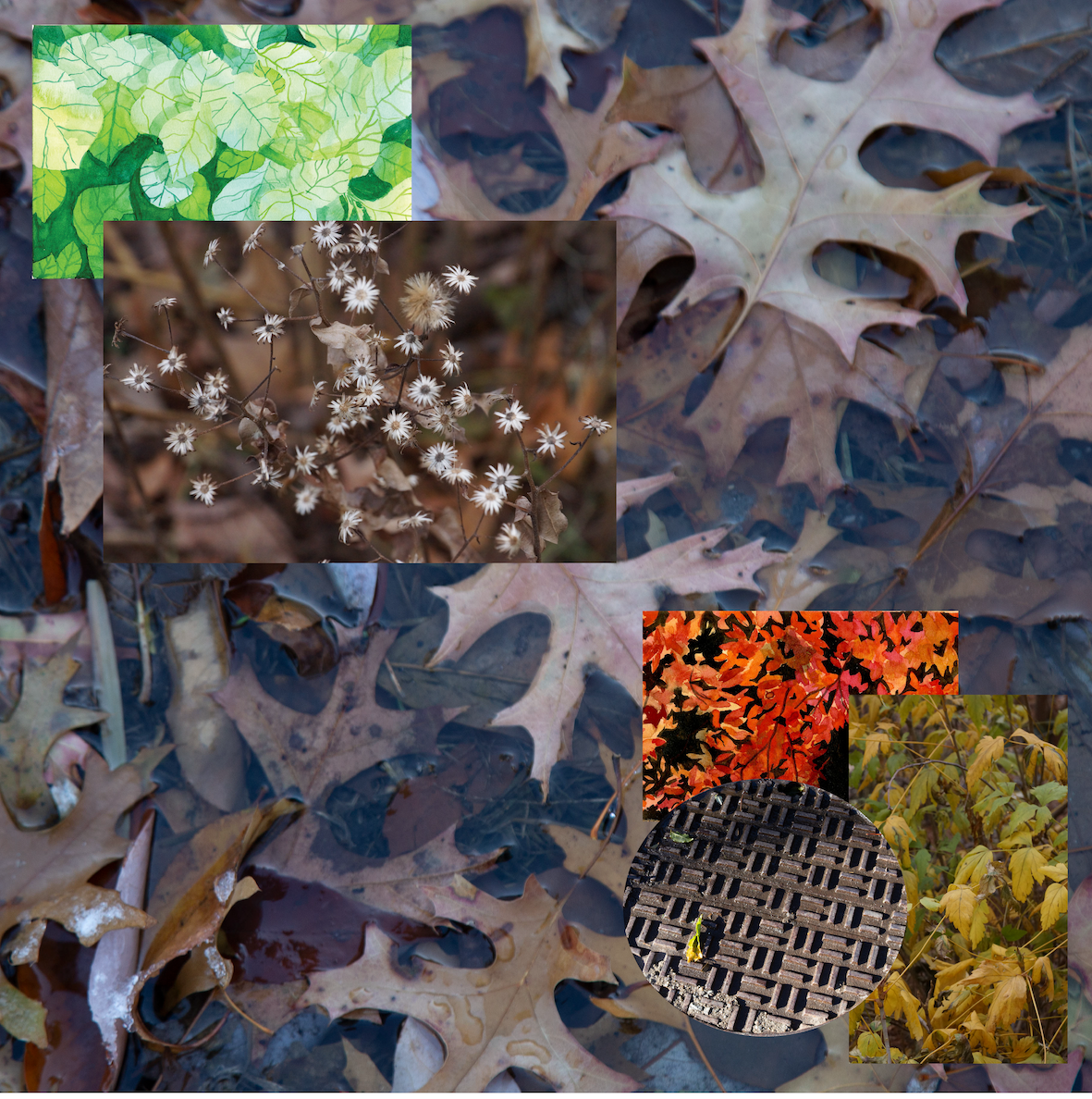
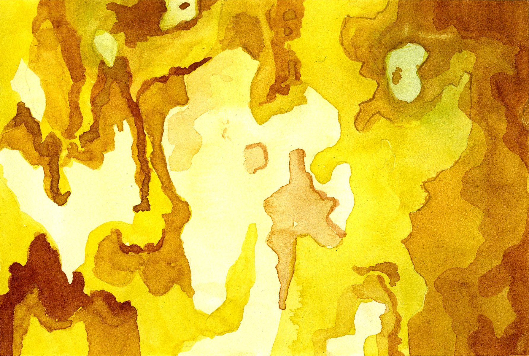
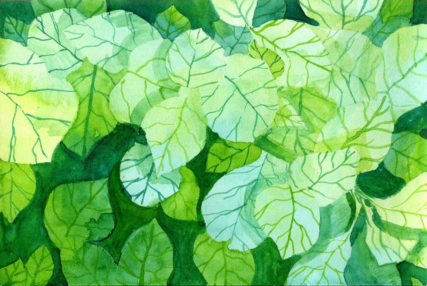
Using watercolours, I tried to 'recreate' some of the photographs. These paintings appeared natural, but can not be separated from the artist as easily as constructed natural spaces.
Reflection
While this collage veered drastically from the original idea, I was pleased with the final collage. Since I was so uncertain about how it would turn out,
it was very satisfying to see it materialise at the end.
So, my final collage highlighted textures across Central Park: the copied, captured and created...
Reference


