A Manifesto
Project Brief
For a class on typography, I had to select a manifesto and design an all typographical poster, that interprets the text and amplifies the text’s voice, tone, and word selection.
Design Process
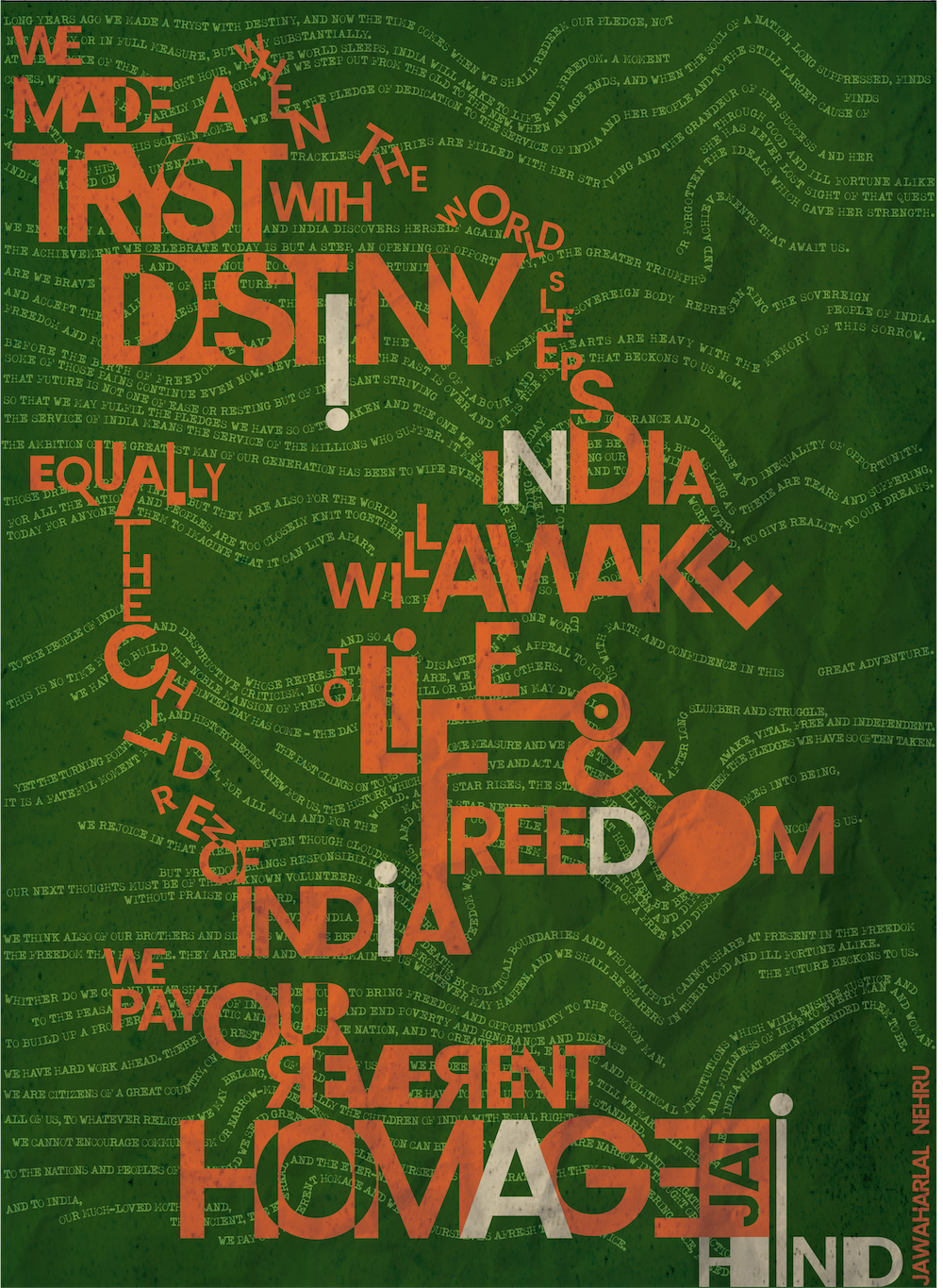
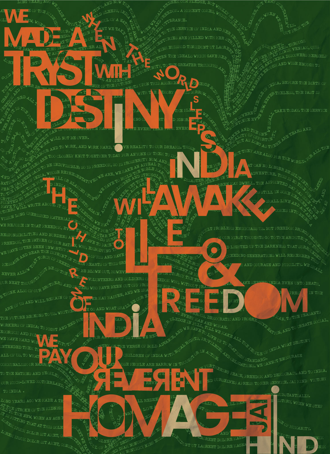
For my 'manifesto', I chose to use Jawaharlal Nehru's speech on the first day of India's independence. Through this poster, I wanted to pay tribute to this moving, patriotic speech. My early sketches were inspired by posters, newspaper ads and government orders of pre-independence India. Satyajit Ray's posters with flat colours and geometric shapes strongly influenced my letterforms.
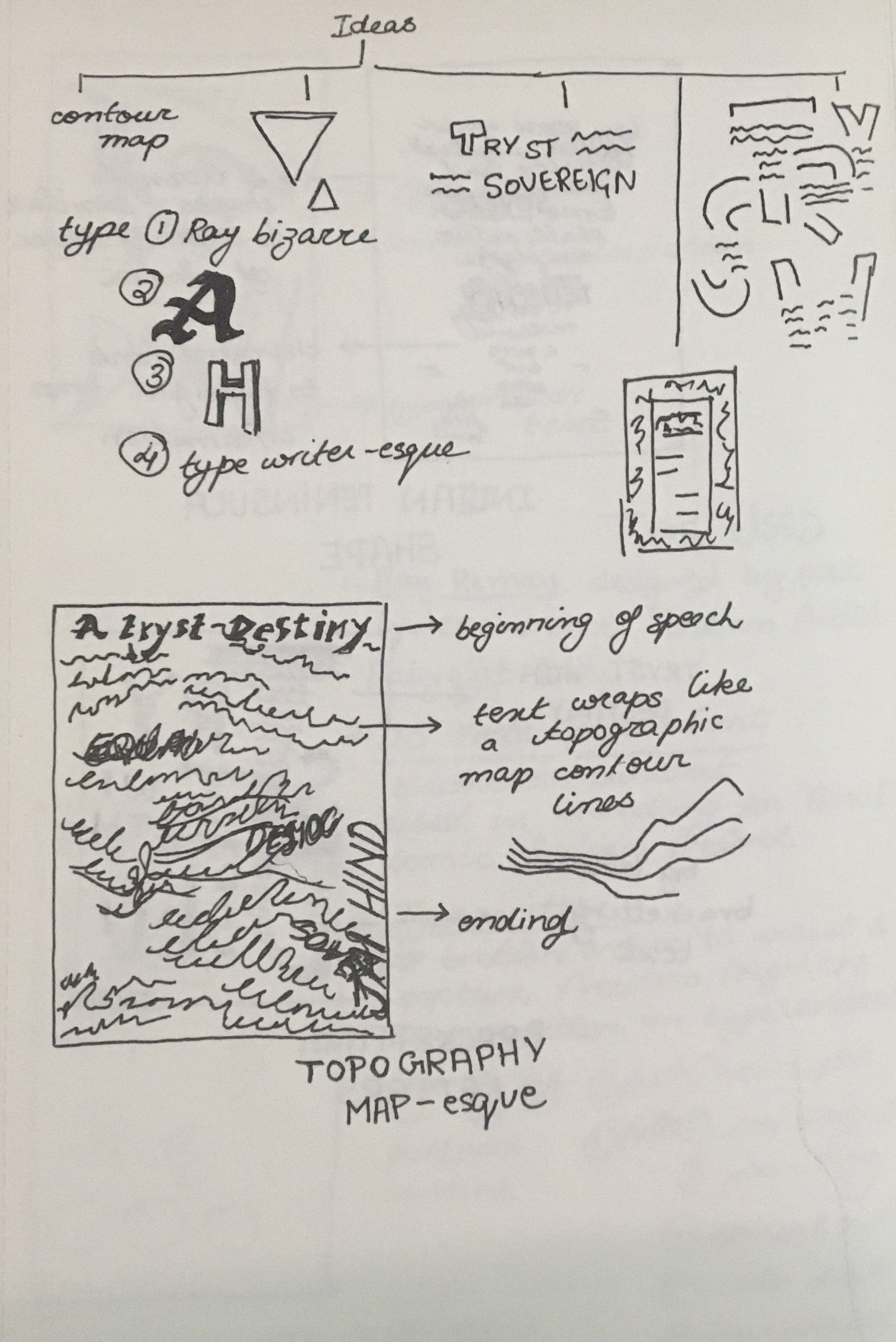
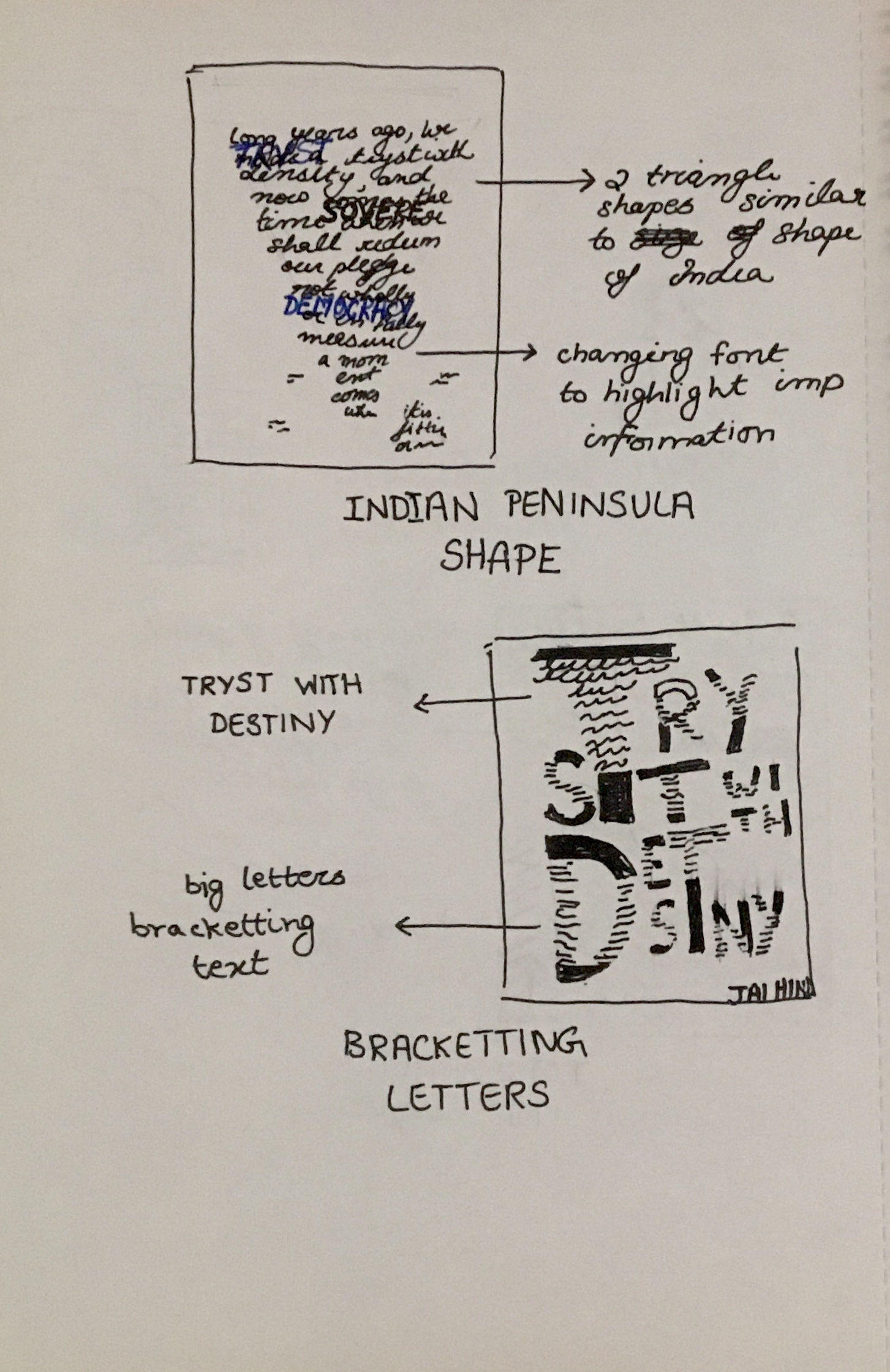
The text copy of the speech forms the background of the poster. I created the wavy text based on geographical maps and contour lines. However, it looks more like a fluttering flag. Combined with the tricolours of the Indian flag (orange, green, and white) the flag sets the perfect tone and backdrop for the speech.
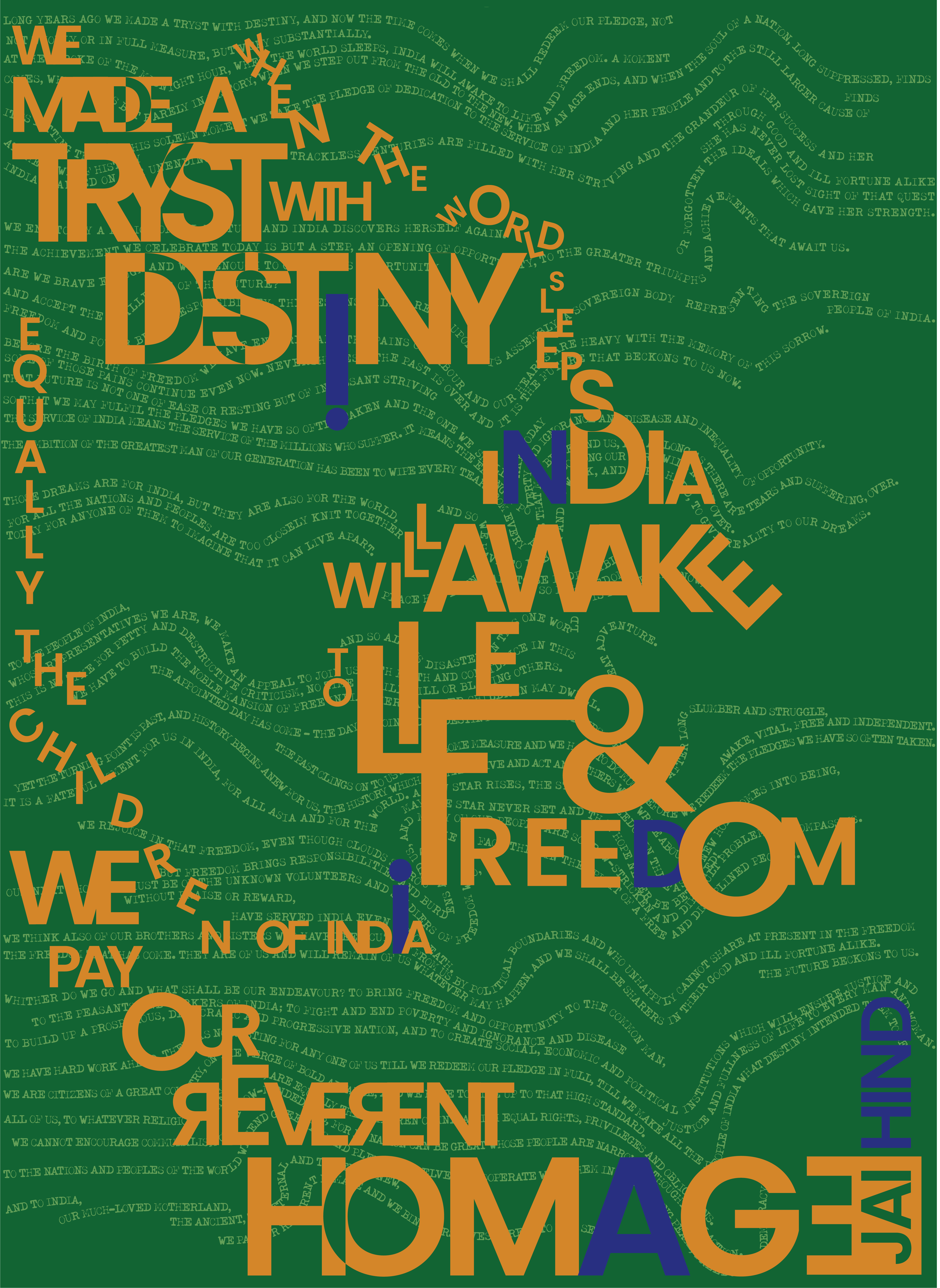
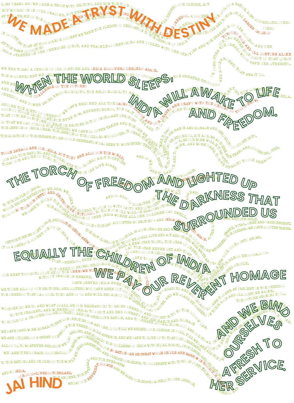
I chose a couple of phrases from the speech to highlight in the foreground of the poster. I manipulated the forms of these words to interact and create a dynamic poster. The words INDIA and HIND are formed by the white letters across the poster.
Reflection
Through this process, I learnt to fine-tune the poster, cementing colours and positions in the poster throughout the drafts. The tiny details became crucial, moving letters and changing the shape of text to create the best composition. The result is a poster that celebrates the spirit of independent India!
Reference


